
This project is really a painting technique that happens to be demonstrated on a sign. The method turns a piece of new plywood into convincingly aged, rotten timber in about twenty minutes, and once you know it you will use it on everything — signs, coffin lids, fence panels, crate boxes, gallows, anything that should look like it has been outdoors for fifty years.
The entire trick is one instruction that feels wrong: do not mix the paint.
Materials
- A piece of scrap plywood, and a 2×2 board for the post.
- Jigsaw.
- A 2 inch brush, a small fan brush, and a fine brush for lettering.
- Brown, black and white paint. Ordinary emulsion or acrylic; nothing special.
- A palette — a scrap of board, a plastic lid, an offcut of card.
Making the sign
Step 1 — Cut the shape
Rough the outline out on the plywood with a pencil or marker and cut it with a jigsaw. Do not try to be neat. Wobbles, overshoots and slightly off-square edges are all improvements here — a perfectly cut sign looks manufactured, and every bad cut reads as a century of weather.
Clamp the work before cutting, keep both hands behind the blade, let it stop before lifting, and wear safety glasses. See OSHA's hand and power tool guidance and the safety page.
Prime both sides with white paint and let it dry.
Step 2 — Brown base coat
Paint the whole sign — both faces and, crucially, the edges — with a solid coat of brown. Edges are what get looked at when a sign is viewed at an angle, and an unpainted plywood edge with visible plies is the single fastest way to lose the illusion.
Let it dry completely.
Step 3 — Second brown coat, and do not let it dry
Apply a second coat of brown, and move straight to step 4 while it is still wet. The wet base is what lets the dark drag in the next steps blend rather than sit on top as a stripe. This is the step people get wrong by walking away to make coffee.
Step 4 — Load the palette without mixing
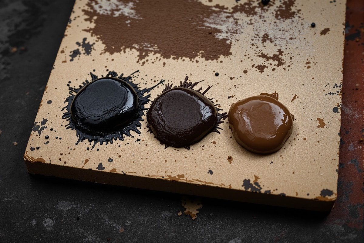
Put a large blob of brown on the palette. Add a smaller amount of black beside it, touching. Then add another small amount of brown beside that.
Do not mix them. Not a stir, not a swirl. What you want on the palette is three adjacent, distinct patches of colour.
Step 5 — Load the brush across all three
Drag the 2 inch brush across all three patches in one pass so that different parts of the bristle carry different colours. Look at the brush before you use it: you should be able to see distinct black and brown areas in the bristles, unmixed.
This is the whole technique. A brush carrying two colours at once lays down grain — light and dark simultaneously, varying along the stroke — in a way that a brush carrying one pre-mixed colour never can. Every stroke is different from the last, which is precisely what real weathered wood looks like and precisely what a uniform mixed colour cannot fake.
Step 6 — Start at the edges
Apply the loaded brush to the outer edge of the sign face first. It will lay down noticeably darker than the plain brown coat underneath. Edges being darker than centres is what happens to real timber — water sits, dirt collects, rot starts at the perimeter — so this is exactly where the dark belongs.
Step 7 — Drag across the face
Now drag the brush across the face in long strokes, following the direction the grain would run. Let the black and brown mix themselves on the board rather than on the palette.
Here is the part worth internalising: the drier your brush gets, the better it works. A wet brush lays down colour; a nearly dry one skips across the surface and catches only the high points, leaving broken streaky grain behind. Do not reload often. Work the brush until it is almost empty, and the last few strokes off a given load will be the best on the sign.
Step 8 — Correct as you go
If an area goes too dark, load the brush with plain brown and drag it across until it lifts back. The technique is entirely reversible in both directions, so there is no way to ruin it — you can keep adjusting until the board looks right.
Step 9 — Finish the faces
Keep going until the whole face is covered with varied, streaky, uneven grain. Stand back frequently: at arm's length everything looks like brush marks, and at ten feet it looks like wood. Ten feet is where it will be seen from.
Let it dry, repeat steps 3 to 9 on the other side, then treat the edges the same way.
Step 10 — Letter it
Paint the message with white and a fine brush — or a fingertip, which produces exactly the right kind of clumsy hand-lettering. Slight irregularity in the letters is an asset.
A black shadow offset down and to one side of each letter is optional but lifts the sign noticeably, especially at a distance and in low light. Only the front face needs lettering if the back will be against a post.
Step 11 — Post and mount
Paint the 2×2 post using exactly the same technique — base brown, wet second coat, unmixed dark drag — so the two match. Then screw the sign to the post.
Set the post slightly out of vertical when you plant it. A leaning sign reads as neglected; a plumb one reads as maintained, which is the opposite of the effect you want.
Age the lettering too
Perfect lettering can undo the wood finish. Plan the message at viewing distance, then make it rougher than feels comfortable at the bench. A short word in broad strokes survives dim light; a long joke in narrow letters becomes grey texture. Leave an uneven margin rather than centring every line with sign-writer precision.
Sketch the layout with chalk or pale pencil, marking only a baseline, centre and outer limits. Those guides keep the word readable without forcing every letter to match. Vary the widths, let one upright lean, and leave corners incomplete. Wear breaks edges and collects grime in recesses, so gaps belong in the paint rather than being added later as identical decorative chips.
When the lettering is dry, drag a little brown across it with the nearly empty wood-grain brush. One or two broken passes are enough. Touch a trace of the dark mixture into selected lower edges and around painted nail heads. Do not outline the entire word: an even border looks designed, while a few interrupted dark pockets appear to have accumulated.
Stand the sign in its intended light before correcting it. Raking light strengthens the grain and weakens the letters; front light does the reverse. Adjust for that view, finish every exposed edge, and keep the lower lettering clear of grass or props. The message should register first and reveal the brushwork only when somebody comes closer.
Where else to use it
Everywhere. Coffin lids, cemetery fence pickets, crate sides, shutters, a "keep out" board nailed across a doorway. It also works on foam tombstones in a greyscale version — white base, unmixed black and grey on the palette, same dry drag — which produces weathered stone rather than weathered timber by exactly the same route.